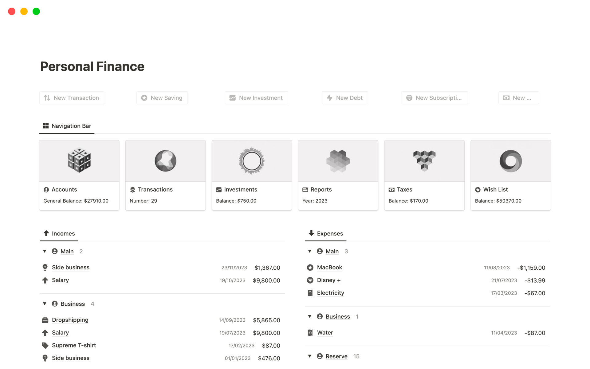
Seeing is Believing: Mastering Visual Investment Tracking for Enhanced Financial Clarity
In the intricate world of finance, where numbers dance across spreadsheets and jargon flies faster than market fluctuations, a simple yet powerful tool can make all the difference: visualization. Visualizing your investments isn’t just about making your portfolio look pretty; it’s about gaining a deeper understanding of your financial landscape, identifying trends, and making informed decisions with confidence.
The Power of Visuals: Why Numbers Alone Aren’t Enough
Let’s face it: staring at rows and columns of numbers can be mind-numbing. While spreadsheets are essential for data storage, they often fail to convey the bigger picture. Human brains are wired to process visual information more efficiently than raw data. Visuals provide context, highlight patterns, and make complex information accessible at a glance.
Here’s why visual investment tracking is a game-changer:
-
Enhanced Comprehension: Visuals translate complex data into easily digestible formats. A pie chart instantly reveals asset allocation, while a line graph illustrates portfolio performance over time.
-
Pattern Recognition: Visual representations expose trends and anomalies that might go unnoticed in spreadsheets. Spotting a consistent underperformance in a particular asset class becomes much easier.
-
Improved Decision-Making: Armed with clear, visual insights, you can make more informed investment decisions. Identify opportunities for rebalancing, diversification, or risk mitigation.
-
Motivation and Engagement: Visual progress trackers can be incredibly motivating. Seeing your portfolio grow (or shrink) in real-time can inspire you to stay committed to your financial goals.
-
Effective Communication: Sharing visual investment reports with financial advisors, family members, or partners becomes more effective. Visuals break down complex concepts and facilitate meaningful conversations.
Visual Tools and Techniques for Investment Tracking
Now, let’s explore the specific visual tools and techniques you can use to track your investments:
-
Pie Charts: Asset Allocation at a Glance
Pie charts are ideal for illustrating how your portfolio is distributed across different asset classes (stocks, bonds, real estate, commodities, etc.). Each slice represents the percentage of your portfolio allocated to a specific asset class.
-
Benefits: Instantly reveals diversification levels, identifies potential over- or under-allocation in specific areas, and simplifies asset allocation discussions.
-
Tools: Spreadsheet software (Excel, Google Sheets), financial planning software (Personal Capital, Mint), online chart creators (Canva, Chart Maker).
-
-
Line Graphs: Performance Over Time
Line graphs are perfect for tracking the performance of your portfolio or individual investments over a specific period. The x-axis represents time (days, weeks, months, years), while the y-axis represents the value of the investment.
-
Benefits: Reveals performance trends (growth, decline, volatility), compares investment performance against benchmarks (S&P 500, bond indices), and identifies periods of significant gains or losses.
-
Tools: Spreadsheet software, financial planning software, brokerage platforms (Schwab, Fidelity, Vanguard), online charting tools.
-
-
Bar Charts: Comparing Investment Returns
Bar charts are excellent for comparing the returns of different investments over a specific period. Each bar represents the return of a particular investment, making it easy to identify top and bottom performers.
-
Benefits: Quickly compares investment returns, identifies investment strengths and weaknesses, and facilitates portfolio rebalancing decisions.
-
Tools: Spreadsheet software, financial planning software, online charting tools.
-
-
Heatmaps: Portfolio Risk Assessment
Heatmaps use color-coding to represent different levels of risk or volatility within your portfolio. Assets with higher risk levels are typically represented by warmer colors (red, orange), while assets with lower risk levels are represented by cooler colors (green, blue).
-
Benefits: Provides a visual overview of portfolio risk, identifies areas of high concentration risk, and facilitates risk mitigation strategies.
-
Tools: Specialized financial analysis software, portfolio management platforms, custom-built spreadsheets with conditional formatting.
-
-
Candlestick Charts: Decoding Stock Price Movements
Candlestick charts are commonly used to analyze stock prices over time. Each candlestick represents the price movement of a stock during a specific period (day, week, month). The candlestick’s body represents the opening and closing prices, while the wicks represent the high and low prices.
-
Benefits: Provides detailed insights into stock price movements, identifies potential buying or selling opportunities, and facilitates technical analysis.
-
Tools: Brokerage platforms, stock charting software (TradingView, MetaTrader), financial news websites (Yahoo Finance, Google Finance).
-
-
Geographic Maps: International Diversification
If you invest in international markets, geographic maps can help you visualize your global diversification. The map highlights the countries or regions where you have investments, allowing you to assess your exposure to different economies.
-
Benefits: Provides a visual overview of international diversification, identifies potential geographic concentrations, and facilitates risk management in global markets.
-
Tools: Portfolio management platforms, custom-built maps using data visualization tools (Tableau, Power BI), online mapping tools.
-
-
Dashboard: The All-in-One View
Investment dashboards bring together multiple visual elements into a single, comprehensive view. A well-designed dashboard might include pie charts for asset allocation, line graphs for performance tracking, bar charts for comparing returns, and heatmaps for risk assessment.
-
Benefits: Provides a holistic view of your portfolio, consolidates key performance indicators (KPIs), and facilitates informed decision-making.
-
Tools: Financial planning software, portfolio management platforms, data visualization tools, custom-built spreadsheets.
-
Best Practices for Visual Investment Tracking
To maximize the benefits of visual investment tracking, consider these best practices:
-
Choose the Right Tools: Select tools that align with your investment style, data needs, and technical expertise.
-
Customize Your Visuals: Tailor the visuals to focus on the metrics that matter most to you.
-
Use Clear and Consistent Formatting: Maintain consistent color schemes, labels, and units of measurement to avoid confusion.
-
Update Regularly: Keep your visuals up-to-date to reflect the latest market conditions and portfolio changes.
-
Seek Professional Advice: Consult with a financial advisor to ensure your visual tracking strategy aligns with your overall financial goals.
The Bottom Line
Visual investment tracking is a powerful tool for gaining financial clarity, making informed decisions, and staying motivated on your investment journey. By embracing visual tools and techniques, you can transform complex data into actionable insights and take control of your financial future.


