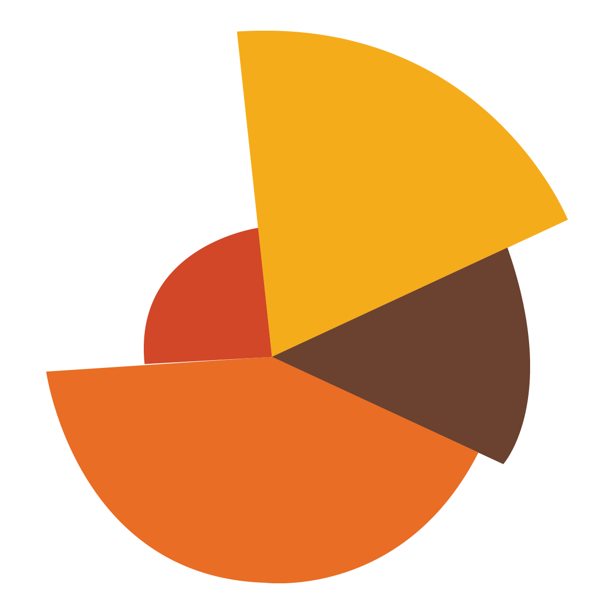
Beyond Slices: Unleashing Creativity in Expense Pie Charts
In the world of personal finance and business management, expense tracking is a fundamental practice. Knowing where your money goes is the first step towards better budgeting, saving, and investment decisions. While spreadsheets and expense tracking apps have become ubiquitous, the visual representation of this data often falls flat. Enter the humble pie chart, a staple of data visualization. However, the traditional pie chart can be limiting. It’s time to explore the realm of creative pie charts that can transform expense data into engaging, insightful visuals.
Why Reinvent the Pie?
Before diving into creative techniques, it’s essential to understand why the standard pie chart might need a makeover:
- Limited Data Capacity: Pie charts are best suited for displaying a small number of categories (ideally, fewer than seven). When the number of slices increases, the chart becomes cluttered and difficult to interpret.
- Difficulty Comparing Values: It can be challenging for the human eye to accurately compare the sizes of different slices, especially when they are close in size or have irregular shapes.
- Lack of Context: Standard pie charts often lack context. They show the proportions of different categories but may not provide additional information about the total amount spent or trends over time.
- Monotony: Let’s face it, rows and rows of standard pie charts can be boring and uninspiring.
Creative Pie Chart Techniques
Here are several ways to breathe new life into your expense pie charts:
-
Donut Charts (Ring Charts):
- Concept: A donut chart is simply a pie chart with a hole in the center. This central space can be used to display additional information, such as the total amount spent, the date range, or a brief summary of the data.
- Benefits: The central area adds visual interest and provides context. The ring shape can make it easier to compare the sizes of different categories.
- Example: Use a donut chart to show monthly expenses, with the total spending amount displayed in the center.
-
Exploding Pie Charts:
- Concept: An exploding pie chart separates one or more slices from the rest of the pie. This technique is useful for highlighting a particular category or emphasizing its importance.
- Benefits: Draws attention to specific categories, making them stand out.
- Example: Explode the "Entertainment" slice of your expense pie chart to emphasize that it’s a significant portion of your spending.
-
Nested Pie Charts (Multi-Level Pie Charts):
- Concept: Nested pie charts display hierarchical data. The inner pie chart shows the main categories, while the outer pie chart shows the subcategories within each main category.
- Benefits: Allows you to visualize complex data relationships and drill down into specific areas of spending.
- Example: An inner pie chart could show main categories like "Housing," "Transportation," and "Food." The outer pie chart could break down "Food" into "Groceries," "Restaurants," and "Takeout."
-
3D Pie Charts (with Caution):
- Concept: 3D pie charts add a sense of depth and visual appeal.
- Benefits: Can be visually engaging, but use them with caution. 3D effects can distort the perception of slice sizes, making it difficult to compare values accurately.
- Best Practice: If you use a 3D pie chart, ensure that the angle and perspective are carefully chosen to minimize distortion.
-
Icon-Based Pie Charts:
- Concept: Replace traditional color-coded slices with icons that represent each expense category.
- Benefits: Adds visual interest and makes the chart more intuitive.
- Example: Use a house icon for "Housing," a car icon for "Transportation," and a fork and knife icon for "Food."
-
Textured Pie Charts:
- Concept: Instead of solid colors, use textures or patterns to fill the slices.
- Benefits: Adds visual depth and can help differentiate between categories, especially for people with color vision deficiencies.
- Example: Use a brick pattern for "Housing," a tire tread pattern for "Transportation," and a checkered pattern for "Food."
-
Animated Pie Charts:
- Concept: Use animation to reveal the slices of the pie chart or to highlight specific categories.
- Benefits: Creates a dynamic and engaging experience.
- Example: Animate the pie chart so that each slice appears one at a time, accompanied by a brief description of the category.
-
Interactive Pie Charts:
- Concept: Allow users to interact with the pie chart by hovering over slices to see more detailed information or by clicking on slices to drill down into subcategories.
- Benefits: Provides a more immersive and informative experience.
- Example: Allow users to click on the "Food" slice to see a breakdown of their spending on groceries, restaurants, and takeout.
-
Infographic Pie Charts:
- Concept: Combine the pie chart with other visual elements, such as icons, illustrations, and text, to create a comprehensive infographic.
- Benefits: Tells a more complete story and provides context for the data.
- Example: Create an infographic that shows your monthly expenses, including a pie chart, key statistics, and tips for saving money.
-
Custom Shape Pie Charts:
- Concept: Rather than a standard circle, use a custom shape to represent the pie chart.
- Benefits: Adds visual interest and can be tailored to the specific context of the data.
- Example: Use a piggy bank shape for a chart showing savings, or a silhouette of a car for transportation costs.
Tools and Technologies
Creating creative pie charts is easier than ever, thanks to a variety of tools and technologies:
- Spreadsheet Software: Microsoft Excel, Google Sheets, and other spreadsheet programs offer built-in charting tools that can be customized to create various pie chart styles.
- Data Visualization Libraries: Libraries like D3.js (JavaScript), Chart.js (JavaScript), and Plotly (Python) provide powerful tools for creating custom and interactive charts.
- Online Chart Makers: Websites like Canva, Venngage, and Piktochart offer user-friendly interfaces and pre-designed templates for creating visually appealing pie charts.
- Business Intelligence (BI) Tools: Platforms like Tableau and Power BI provide advanced data visualization capabilities for creating complex and interactive dashboards.
Best Practices for Creative Pie Charts
- Keep it Simple: Avoid cluttering the chart with too many categories or unnecessary visual elements.
- Choose Colors Wisely: Use a color palette that is visually appealing and easy to distinguish. Consider using contrasting colors for adjacent slices.
- Label Clearly: Label each slice with the category name and the percentage of the total.
- Provide Context: Include additional information, such as the total amount spent or the date range, to provide context for the data.
- Test and Iterate: Get feedback on your pie charts and make adjustments as needed.
Conclusion
Pie charts don’t have to be boring. By embracing creativity and exploring the techniques discussed above, you can transform your expense data into engaging, insightful visuals that help you better understand and manage your finances. Whether you’re tracking personal expenses or analyzing business spending, a well-designed pie chart can be a powerful tool for making informed decisions.
The key is to experiment, think outside the box, and find the visual style that best suits your data and your audience. By doing so, you can unlock the full potential of the humble pie chart and turn it into a dynamic and informative asset.


